Business Cards - by Sherry Bach © 2014
The Project: go through 500 business cards and cross reference them to outlook contacts, adding new information and/or updating existing info. Note: new cards outweighed cards that needed updating by 3 to 1.
The Take Away: after subconsciously studying 500 business cards, question after question was raised in my mind about the purpose of business cards, ergo this write up.
Questions:
1. Why do people want to frustrate others with their business cards?
2. Have people even thought of what the intended goal of the business card is?
a.) To have people remember your #
b.) To have people remember your name
c.) To have people "contact" you which might eventually result in a job, a sale, or some positive impact to your life or brand
d.) To make it easy to contact you
e.) To use as a platform to transfer your info to another portal
3. Do people just willy nilly allow others to decide for them how their business card should look?
4. Why do people use a font size of 8 on a business card with a lot of white space around the text?
5. Why is the website NOT on the card?
In looking at those questions, here's my 2 cents worth of advice as someone who has seen a boat load of business cards during my 35 year career:
1. Don't ever use letters in place of numbers in your phone number. This will frustrate your reader.
Do you really think people have the time or the desire to spell out on the key pad, your business name? If your intended goal with this is to have folks remember your business name, first of all, it doesn't work; second of all, using letters in place of numbers is risky because you could potentially lose a potential customer like me, who will intentionally forget your business name because you have frustrated them and made contacting you more difficult, not easier? You've heard it said…Ain't nobody got time for that!
2. Don't use a font size so small that someone needs a magnifying glass to read your information. This will frustrate your reader as well.
One card used neon orange on part of the information. Neon orange is good on a large billboard that has a black background but neon orange is hard to read on white paper especially if the font size is 8!
3. Don't use a glossy stock. This will frustrate your potential new contact.
Most people write on business cards and if it has a slick surface they won't be able to.
4. Include your website on your card if you have one. There is plenty of room…trust me!
One of the cards in the stack could have been cut in half, with one half totally blank. The back of this card was also totally blank. You are paying for the entire piece of card stock, use it. Give me one good reason why you don't use all of the white space on at least one side of the card? Give me one good reason why your website is not on the card?
5. Think about what you want to accomplish with your card and then assess whether or not the card meets that goal.
6. Don't waste your money on a really thick card stock.
Your new contact may be able to scrap ice off of their car window with your business card but is that your intended goal for the card?
Most people transfer the information to another portal like outlook contacts, and then throw your card in the trash.
7. If you really want people to contact you (isn't this the entire goal of the card?) include your cell # or the number where you can be easily and directly reached.
On a totally separate note, this project also forced me study emails by association which raised another question:
Why do businesses make their employee's emails so long and hard to remember?
Look, if people don't remember your brand, your business name or your name, having to type it out in an email is NOT going to get them to remember it, it's only going to work to frustrate your new contact. Who cares what your last name is? Does it really matter that they know it at the onset? If a relationship is established, they will eventually come to know your last name. Furthermore, who cares that your entire business name is included in the email? It's just more for the person to type in the field and once an email starts to automatically populate, nobody looks at it more than two seconds.
I have to say my own email address over and over on the phone at least ten times a day. I have to say "S" as in "Sam," "B" as in "Boy," "A" as in "Apple," etc…for each letter including the business name.
People are busy. People like things simple not cumbersome. The easier it is to contact you, the better. May I suggest a simple email such as: rob.thechurch.com or 12.3.com I'd go for shorter, not longer.
The project in its entirety convinced me of a couple things:
There are folks out there in the marketing world who have NO clue what they're doing!
Most people are out of touch with their audience/consumer/client and have not kept up with modern ways of doing things; they are rarely the harbinger of more efficient ways to do things. Have you seen the new and improved square business cards? Oy vey!
Sherry Bach is a published author and freelance writer. In addition to writing, her full time work experiences include: 2 years retail management; 5 years in banking; 4 years in state government (Montana); 3 years commission only sales; and 18 years in healthcare.


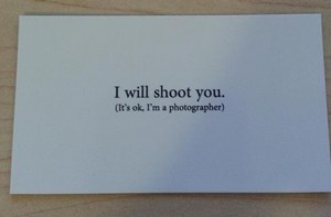




The absolute worst business cards I've seen are those used for high school graduation. Even though I have trouble handling them, from time to time I've been known to sort through the cards I have hoping to find a phone number for someone that I'm trying to contact, only to find that the phone number is no longer valid. I miss being able to dial "411" and find out. Googling for personal websites can be frustrating as well. Many turn up with "this domain for sale."
Ron