Another Cover by Todd Cheney
Last edited: Thursday, March 24, 2005
Posted: Thursday, March 24, 2005
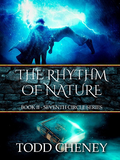
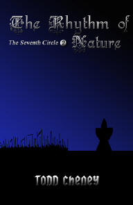
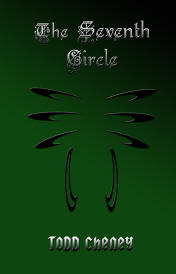
And here's one for the second book. I think there's too much open space in the middle, but the black shadow approach doesn't allow me to fill it with anything else.
Perhaps I should put the hooded figure on a hilltop and have the army climbing to meet him. That could be good. But I haven't decided yet.
There's a lot of space in the middle. You need some way to draw the eye between the title and the imagry. Maybe longer grass or gradually fading color....
I love the font on the title. Grabbing. I agree, too much space inbetween. Is it possible to move "The Seventh Circle" under the word "Nature"? From this display, I didn't know that was a hooded figure and the army. Very dark. Does it show better in person?



M.Rose
I love the font on the title. Grabbing. I agree, too much space inbetween. Is it possible to move "The Seventh Circle" under the word "Nature"? From this display, I didn't know that was a hooded figure and the army. Very dark. Does it show better in person?
Congratulations on your continued success!
Cynthia